In the world of branding design, a logo is never just a logo. It’s a story and a strategy – like a visual handshake between a brand and its audience. In 2025 I designed some of my favorite brands, so I’m taking you behind the scenes of this curated selection from my graphic design portfolio. This post is a deep dive into the creative process behind each identity, so stick around to browse inspiring brand identities, explore branding services, or spark ideas for your own business.
1. Branding Design Refresh for Charleston Tea Garden
Project Type: Brand Refresh
Scope: Full brand guidelines, color palette, typography system, badge + horizontal logo variations
Charleston Tea Garden already had an iconic visual identity tied to tradition and regional pride. My job as a graphic designer was to refine, not redefine. The client wanted a cohesive brand guide that brought consistency across platforms without straying from their established look.
The new system includes a vibrant badge logo and a horizontal variation designed for improved application across packaging and digital assets. The typography mix of Alegreya and Overpass adds a classic-meets-modern edge, while the rich greens, caramels, and warm citrus hues deepen the sensory experience of the brand.
This branding design project is a great example of how even legacy logos can benefit from strategic design elements to build credibility, increase usability, and better reflect an evolving brand personality.
2. Complete Brand Strategy for The Gut & Microbiome Center
Project Type: Brand Identity Build from Scratch
Scope: Primary and secondary logo suite, brand guide, typography, color palette, pattern, sister brand
Few things are more exciting than designing a brand from the ground up. The Gut & Microbiome Center needed to stand independently while subtly referencing Dr. Bulsiewicz’s existing platform (TheGutHealthMD.com).
The result is a clean, adaptable visual identity that communicates trust and innovation. Drawing from natural design elements like sun, soil, and flora, the resulting visual combines gut flora and subtle scientific forms. Paired with a custom palette (Flora Teal, Scrubs Green, and Clear Skies Blue), the brand feels grounded and elevated.
For its sister brand, Microbiome Method Coaching, I took a minimalist approach with a simple wordmark and familiar color system to ensure cohesion. Together, these logos create a unified brand system that aligns with client values and business goals.
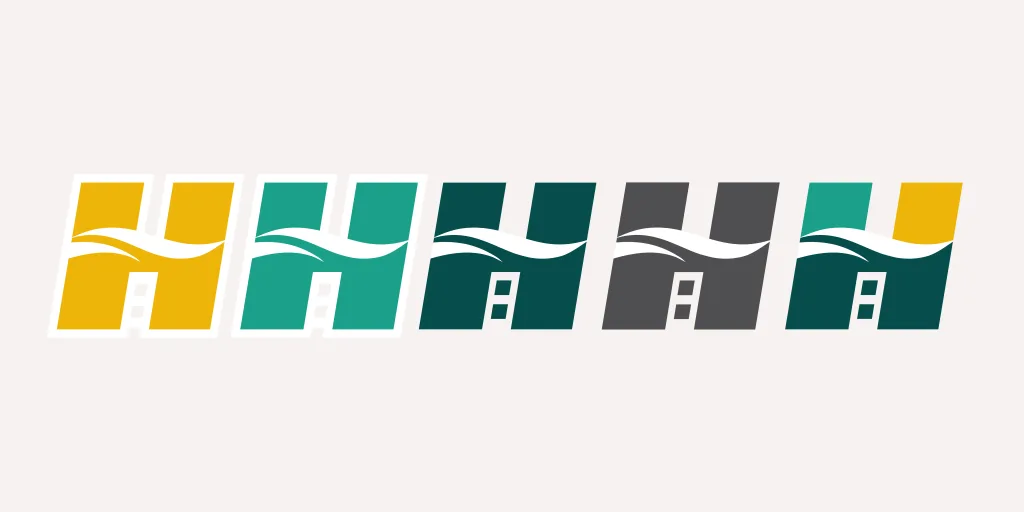
3. Unified Visual Identity for Harbor Logistics
Project Type: Brand Identity After Merger
Scope: Logo suite, color palette, typography, iconography, brand guide, business cards, e-mail footer
When two logistics companies merged to become Harbor Logistics, the goal was clarity and unity. I created a new logo design that symbolizes strength, movement, and connection: a stylized “H” integrating roads, waves, and rail to reflect multi-modal logistics solutions.
The type face, bold, geometric, and modern, was deliberately chosen to balance professionalism with approachability. A flexible color palette blends stability (deep green) with energy (beacon yellow). The final brand identity helped the client build trust both internally and externally, showing how good branding design supports organizational change.
This project is a reminder that branding isn’t just a powerful tool for marketing. It’s an essential step in navigating change with confidence.
4. Luxury-Adventure Brand Personality for Palmetto Crest Outdoors
Project Type: Logo Refresh + Brand System Expansion
Scope: Refined logo, elevated variations, color system, iconography, brand patterns, typography
Palmetto Crest Outdoors had the vision – an anchor in their logo, an outdoorsy feel – but needed refinement to connect with a premium adventure audience. The updated logo suite includes cleaner lines, a more symmetrical crest, and elegant serif-sans font pairings.
One of the standout features is the elevated logo where the anchor becomes the “T” in “Palmetto” – a detail that adds character and memorability. The wave-inspired brand pattern adds movement and depth to marketing collateral.
This visual identity is proof that the right graphic designer can elevate rough concepts into a full-fledged brand that feels tailored, high-end, and authentic.
5. Branding Design and Guidelines for Physician’s Plan
Project Type: Brand Refresh + Application System
Scope: Refined logo, stamp logo variation, type and color system, brand usage guidelines
Physician’s Plan needed a strategic refresh that didn’t abandon their existing recognition but instead clarified usage. I designed a polished, consistent visual identity that could scale globally across franchises and media.
I redesigned the spiral (koru) to include varying tints of their core brand colors, adding layers of dimension. The typography (Gantari + Radley) creates balance across headers and body copy, and a newly created stamp logo gives them versatility across mediums.
A strong brand strategy is creative AND practical. This project shows how structure supports speed, allowing in-house teams to apply designs confidently and consistently.
6. Personal Branding for Dr. Ingrid Clayton
Project Type: Full Personal Brand Development
Scope: Logo, color palette, typography, Substack banner, email signature, social templates
Dr. Ingrid Clayton’s personal brand had to reflect her experience as a psychologist and author, while also supporting her upcoming book launch and digital presence.
Her logo is minimal but impactful, using a circular radiant shape to signal clarity and healing. We used sunset oranges and pinks with golden tones to evoke a warm, uplifting energy. The typography blends sophistication and playfulness, aligning with her brand personality and tone
This brand was built for a diverse set of platforms (like Substack, LinkedIn, social media, email) and had to make a lasting impression in every context. The work highlights how personal branding is becoming one of the most essential tools for thought leaders and entrepreneurs.
Reflections on Brand Strategy & Creative Process in 2025
If there’s one insight I’d share from this year’s design work, it’s this: every brand identity starts with intention. Every client is different, every industry has nuance, and every platform creates new challenges. The best branding services will always adapt.
What makes a logo or visual identity resonate? It’s the combination of smart design elements, clear positioning, and a tone that reflects the brand’s personality. Each design decision – from icons, to typography to color palette – shapes how a brand shows up in the world.
Great design is requires great strategy. It’s storytelling. It’s how we build trust with audiences and help businesses grow.
Remember: your brand is your reputation, your first impression, and your most consistent spokesperson.
Let’s Create Something That Speaks.
If you’re looking to level up your own brand in 2026, let’s talk. Whether you’re refining your logo, launching a new website, or building a complete visual identity, Matchstick’s approach blends strategic insight with standout creativity.
Explore our full graphic design portfolio to see more. Or connect with our team to learn how our branding services can bring your vision to life.